
Building a scalable component foundation to bridge design and engineering at Bitkub.
Project Context
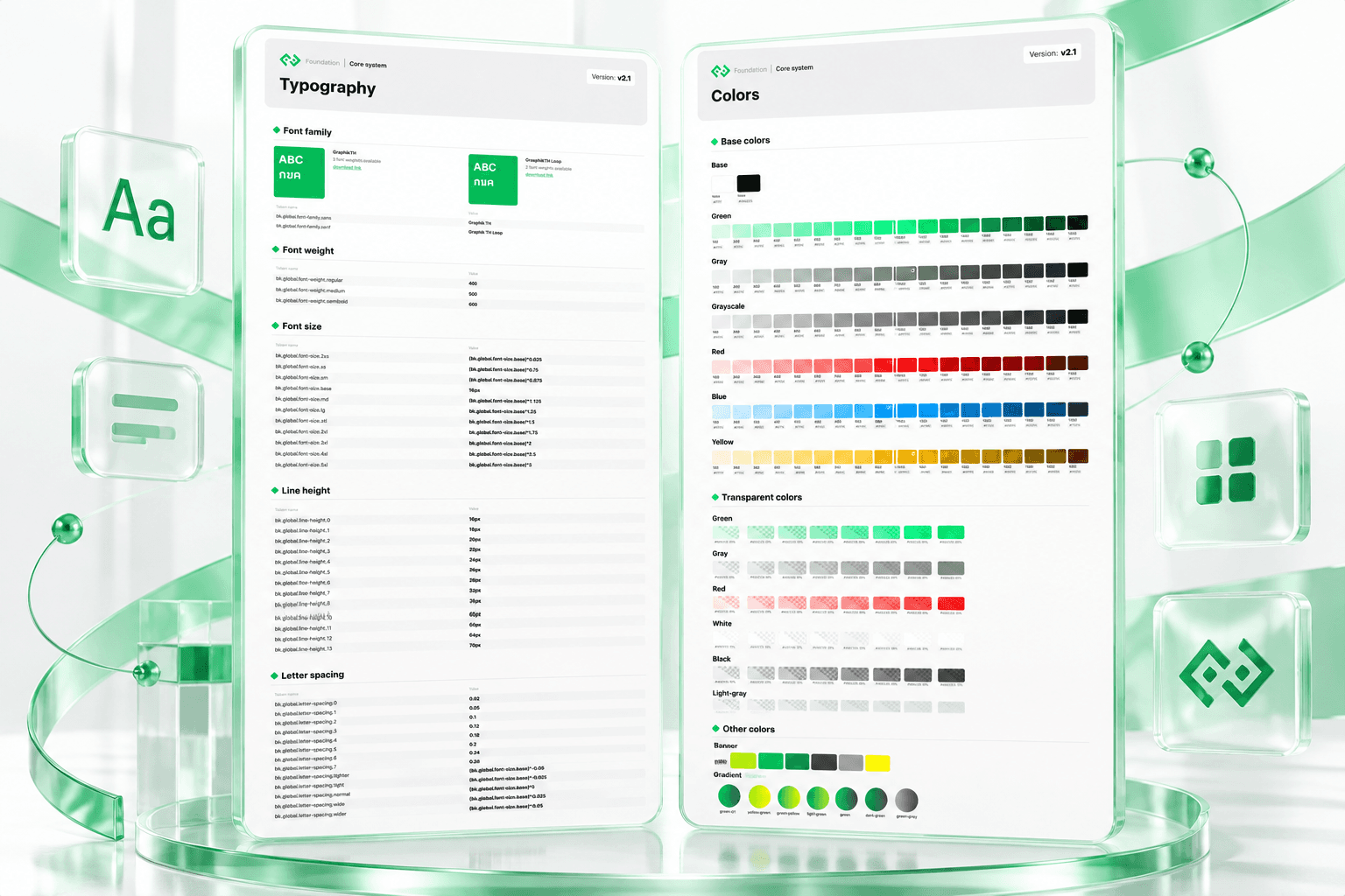
Bitkub’s existing product continued to rely on its original design system, Version 1, while the team began developing Version 2 to support a new visual direction and future product redesigns. This initiative introduced a more structured approach to design tokens and reusable UI components, helping designers and engineers align on shared visual foundations and implementation requirements.
I worked closely with the design manager to develop the new component library, establish design token structures in collaboration with engineering, and support ongoing discussions around component requests, UI issues, and implementation changes.
The Challenge
Bitkub’s product required continuous maintenance, particularly to address security-related needs and ongoing product changes. While the existing Version 1 design system remained in active use, the team was developing Version 2 with updated colours, typography, and reusable components.
Managing both versions created several challenges:
01 —Two design systems in parallel
Designers needed clarity on when to use existing Version 1 components and when to develop or use Version 2 components.
02 —Design–engineering alignment
Design decisions needed to be translated into a consistent token structure that engineers could understand and apply.
03 — Component scalability
New components needed to accommodate different sizes, states, variants, and interaction requirements without creating unnecessary duplication.
04 — Colour accessibility and practicality
Existing colours had already undergone contrast testing, so introducing new colours required careful consideration to avoid undermining accessibility or expanding the colour palette unnecessarily.
The goal was to establish a stronger foundation for future product redesigns while maintaining the existing system until Version 2 was ready to be adopted.


My Contribution
1. Establishing the Design Token Foundation
I collaborated with the design manager and engineers to contribute to the new design token structure, connecting core visual decisions such as colour and typography with the component library.
My focus was to help create a consistent foundation that could be reused across components and support closer alignment between design specifications and engineering implementation.
Colour decisions required particular care. Rather than introducing new values whenever a component presented a challenge, we prioritised the existing palette and its tested contrast values. New colours were considered only when the current tokens could not adequately support a practical use case.
2. Building the Reusable Component Library
I created reusable UI components based on the new colour and typography foundations, using Auto Layout to make them adaptable and easier to maintain.
The component library covered:
Buttons: Different sizes, types, states, and icon combinations.
Selection controls: Checkboxes, radio buttons, and toggles.
Selection patterns: List-based and card-based selection.
Form elements: Text fields, text areas, and dropdowns.
File upload: A reusable component for document-upload interactions.
Components were structured to accommodate different interface requirements while maintaining visual consistency. I also worked on supporting both light and dark themes.
3. Supporting Design–Engineering Collaboration
My responsibility extended beyond creating components in Figma. I acted as a point of contact when designers needed new components or encountered problems using the existing library.
I also joined discussions with engineers to clarify design specifications, answer questions, and address UI component changes or implementation issues.
This ongoing collaboration helped surface practical constraints early and supported a shared understanding of how components should behave across design and development.
4. Managing the Transition from Version 1 to Version 2
Because Version 1 still supported the live product, the new system needed to develop alongside ongoing maintenance rather than replace the existing library immediately.
During this early stage, the design manager and I took responsibility for handling new component requests and refining the Version 2 library as requirements emerged.
The new components were intended for upcoming redesign work, including the revamped KYC onboarding experience. This provided a planned starting point for adopting the new system without disrupting the existing product.


Design Token & Component Approach
The work followed four principles:
Consistency
Establish shared colour and typography foundations so components follow the same visual rules.
Reusability
Build flexible components with reusable variants, states, sizes, and icon options rather than recreating similar elements.
Accessibility
Preserve tested colour contrast and introduce new colours only when existing tokens could not meet a genuine requirement.
Engineering Alignment
Discuss component behaviour, implementation questions, and changes directly with engineers to keep design specifications practical.

Outcome
This project helped me understand how design systems operate beyond the visual layer. Design tokens create a shared foundation between design and code, while well-structured components make that foundation practical to apply across product interfaces.
It also highlighted the importance of managing adoption carefully. A new system is not simply a replacement for the old one; it needs clear usage guidelines, ongoing ownership, and coordination with product maintenance and engineering workflows.
The project established an early foundation for Bitkub’s Version 2 component library, including reusable UI components built around updated colour and typography foundations, Auto Layout, and light and dark themes.
At this stage, Version 2 had not yet been rolled out across the existing product. The work prepared the component library for future redesigns and established an ongoing process for handling component requests, resolving UI issues, and collaborating with engineering as the system evolved.


